
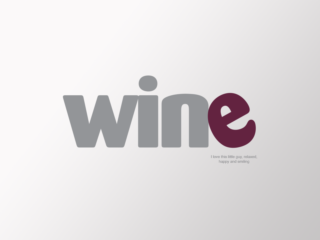
The Wine Room is a unique, casual, and cozy wine bar & bistro offering continental cuisine, boutique wines, and craft beer in a relaxed setting reminiscent of a European cafe. The all type logo is set in all lower case to reflect casual and chill nature of
the restaurant, a place where you can meet friends and family and know it'll be a place to unwind and have a good time. In fact, the "e" is smiling and because it's so at ease, it leans back and makes itself comfortable. It's ready to hang out and enjoy the experience.
the restaurant, a place where you can meet friends and family and know it'll be a place to unwind and have a good time. In fact, the "e" is smiling and because it's so at ease, it leans back and makes itself comfortable. It's ready to hang out and enjoy the experience.

Two of the other concepts presented to the client. I really love the lower one and would love to have seen it on t shirts and wine totes.

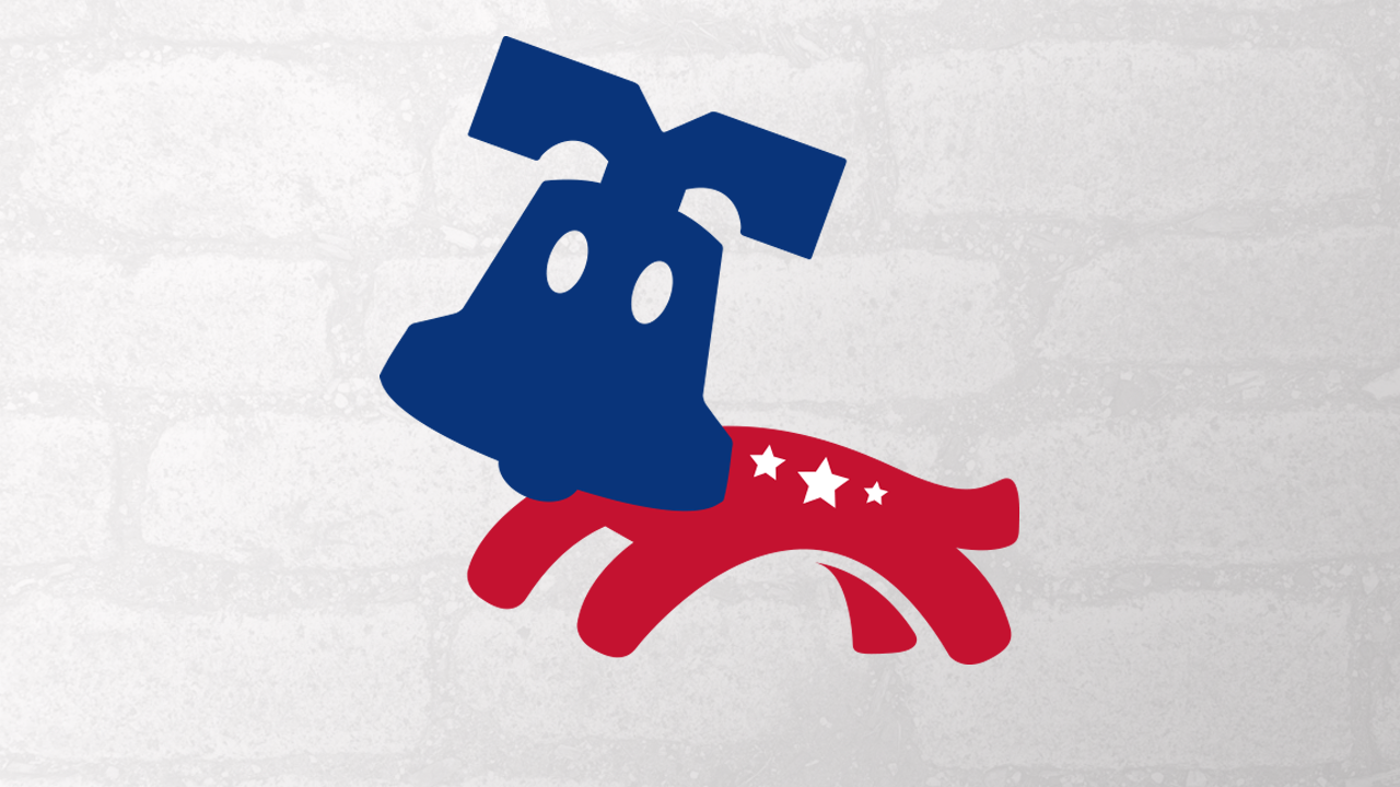
The Towne Barker is a Philadelphia based doggie daycare, boarding and training center. The client wished to tie the logo into the historic nature of the city, but in a modern way. While researching, and seeing millions of "Liberty Bell" logos for local businesses, I thought, no way am I doing that. After many, many sketches, I started looking at different dog breeds for inspiration, when I came upon a photo of a schnauzer. Low and behold, I saw the shape of the Liberty Bell. From there, it was easy to imagine the yoke as the ears, the lip as the "mustache" and the clapper as the nose. What made me even happier is that once everything came together it didn't look like a specific breed, but a happy, romping doggie.
The body was inspired by a local truss bridge, which in this case is curved. The body spans the water below it.
The body was inspired by a local truss bridge, which in this case is curved. The body spans the water below it.
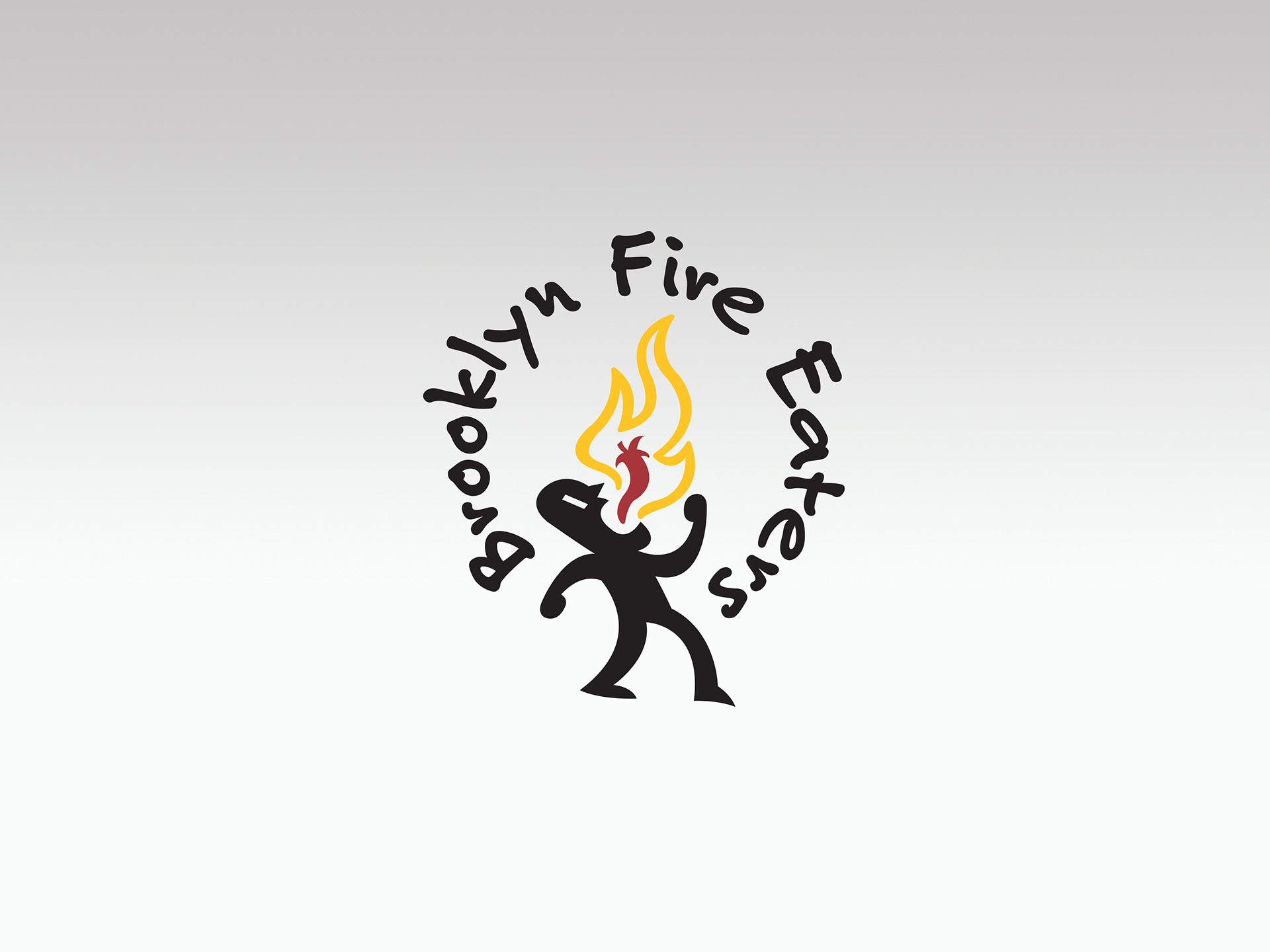
Brooklyn Fire Eaters started off in a local bar where regulars began making and sharing their hot sauce creations. This logo concept is based off the plethora of graffiti throughout the borough and a fire eater seen at Coney Island. The "fire man" is ready to take on anything and everything, eager to show he how tough and strong he is. He's practically screaming, "Bring it on!"
This eventually led to one of the bartenders going so far as manufacture his own sauce... see below.
This eventually led to one of the bartenders going so far as manufacture his own sauce... see below.

A result of Brooklyn Fire Eaters, the Brooklyn Petro brand is centered around automotive ephemera.

This concept came about, again after many, many sketches, I started focusing on the essence of what a flight school is and why people want to learn. It all boiled down to the idea of personal freedom and soaring high above the clouds. This was the "wild card" idea that I usually present as one of three concepts to a client. The first two are based off research and a comparison of the competition in order to capture the essence of what the client offers in a way that is completely different than anything out there, maybe even a little off kilter. This one is the version the client selected and is the first and only time I feel like I oversold an idea, because I was so proud of the rejected concept below...

While I do love and am proud of the chosen logo above, I was so proud of the "hidden meaning" when I used the negative space to create the initials of the client and it formed an airplane. Add a prop to it and tilt it at an angle which reflects the energy and excitement of learning to fly.
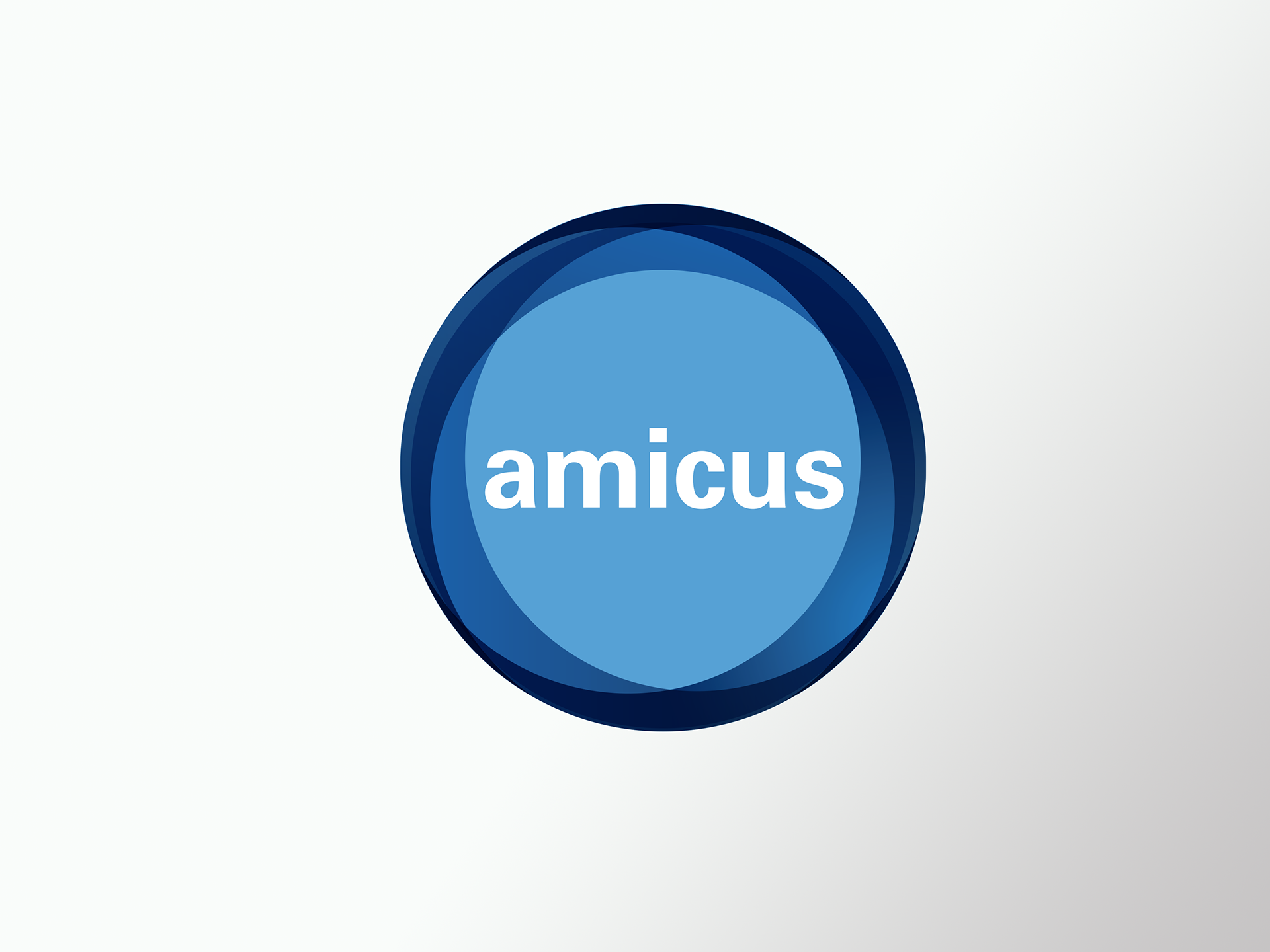
Amicus is a Philadelphia based business traveler hospitality service seeking to provide visitors with local knowledge and expertise in order to ease their introduction into the local business community. The concept centers around the globe and the speed and path of the traveler. The globe has the wordmark Amicus, a Latin word meaning "friend" or "comrade," in the middle, signifying that you have an ally right in the thick of where you need to be and where you need to go.


Alternate logos for different divisions of Amicus.

A logo for a plumber whose last name begins with a "G." What can I say... working on the After Effects version now.

One of my step sons played the guitar in the band in high school. During one of the concerts, being a designer who never stops coming up with ideas, I thought to myself, they need a new logo that they can put on t shirts and sell to raise money for band activities. The school mascot is a cardinal, which I immediately began doodling concepts for. I came up with three designs and before each final logo, there is one of the final sketches before I moved to Illustrator and began my work.
For all three logos, the placement of the "fingers" and hands are copied from the artists.
For all three logos, the placement of the "fingers" and hands are copied from the artists.
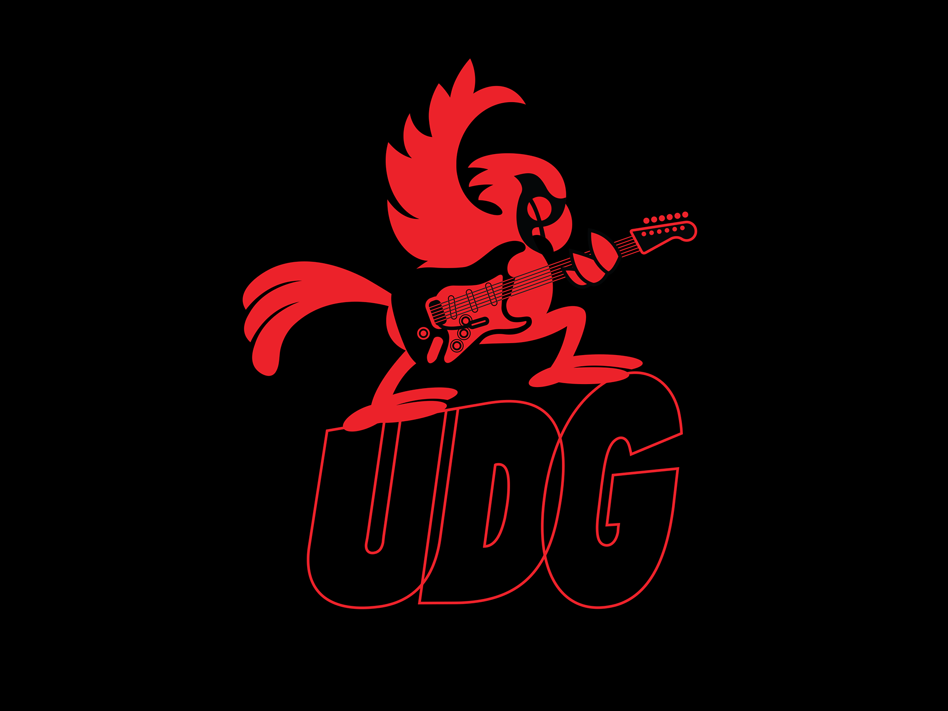
Logo #1 is based off Pete Townsend.
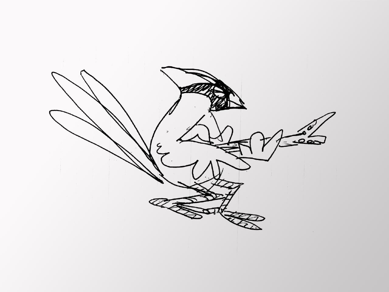
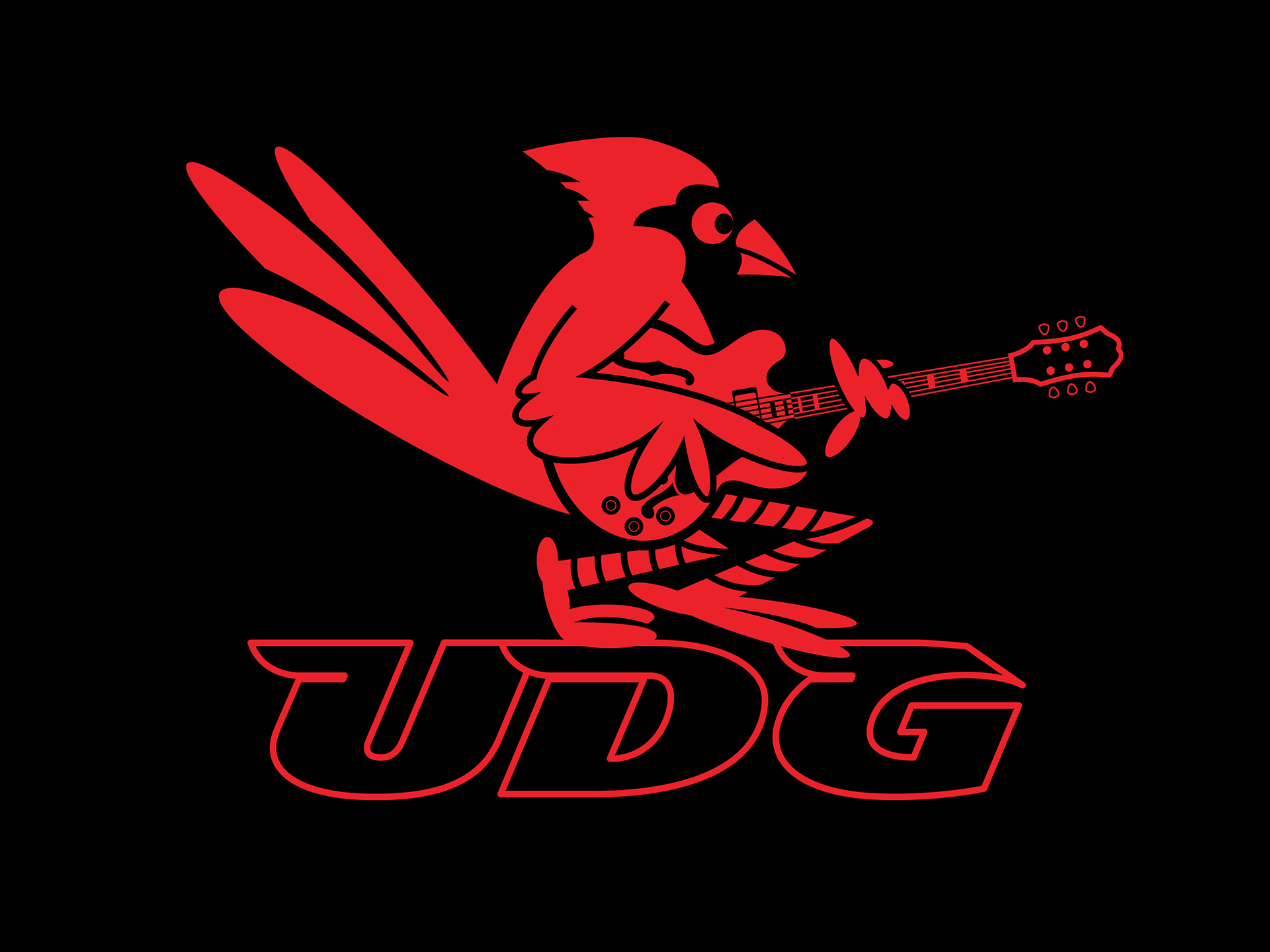
Logo #2 is based off Chuck Berry and his chicken walk. I realllly need to animate this one, too. Hmmm, maybe all three.


Logo #3 is based off Angus Young and his stage stomp.


This logo is for a t shirt company that focuses on food related themes.
This one is for a photographer whose initials are JF, which after many hours sketching, developed into a face with one eye open the other closed and the hands framing the next shot.

A private chef client needed a new logo. Her business developed a meal plan for each week and delivered the meals along with heating and serving instructions to her clients' homes. Naming was not part of the request, but I'm so happy that I decided to show one variation with one that I had come up with that seemed to match the home made service and the love that went into the preparation.


Logo for a Brazilian Jazz show for an Atlanta based radio station.